Formstack Documents
When Formstack acquired Webmerge (later renamed Formstack Documents), a document automation tool, I started the process of evaluating the user experience by performing a heuristic evaluation, creating a site map and UI inventory, carrying out a customer survey, and designing for improving the onboarding experience. I organized all the information into a slide deck and presented to Webmerge’s CEO and development team. The team didn’t have a dedicated designer at the time, and this report was intended to help their developers make UX improvements independently until a full-time designer was hired.
At a glance
Problem
Webmerge was a very powerful tool, but required a lot of technical knowledge to be used successfully. It was difficult for less tech-savvy customers to onboard, and as a result, the company experienced a lot of customer churn.
Results
Usability issues identified and validated by customer data. Proposed UI style guide and improved onboarding experience designs.

Site mapping

Snippet of the heuristic evaluation document for Webmerge
Heuristic Evaluation
Goals
Identify top 3 UX issues to fix by carrying out a heuristic evaluation.
Process
I began by creating a site map to learn the layout of site content. I then created notes document where I took screenshots and write notes about usability issues I found while exploring the app. Next I compared notes to a set of predefined heuristics (Neilson Norman Group and a gathered heuristics list from University of Missouri-Kansas City usability team) and used that to help identify problem areas.
Results
Top 3 Improvements Identified
Consistent use of colour, text styles, and links/buttons
Carried out UI inventory and proposed a simple starter style guide to improve their UI
Adding error states and fail safes
Provided examples of places they could help users recognize, diagnose and recover from errors, and prevent errors from happening (like losing unsaved changes)
Unhiding hidden content, reducing clicks
Webmerge hid features and settings behind links and accordion containers. Unhiding this content reduces the clicks required for the user, and allows the user to quickly retrieve all the functionality that’s available to them
UI Inventory
Goals
Simplify UI and create consistency by creating a style guide (constrained set of colours and text styles) for Developers and future Designers to use.
Process
Step 1
Identify all colours used
Identify all fonts, font weights, and text sizes used
Identify all link and button styles
In the future, all UI components could be logged and redesigned
Step 2
Choose a constrained colour palette
Choose a set of typography styles
Redesign link and buttons styles
Choose consistent spacing for padding and margins
Results
Identified 54 unique colours and 55 unique text styles
Created mockups showing the impact of simplifying colours and text styles
Designed a simple starter style guide that the developers could use to improve the UI

Typography inventory

Proposed Style Guide

Building the survey in Formstack (bonus: I also designed the form builder tool)

Snippet of the heuristic evaluation document for Webmerge
Customer Survey
Goals
Gather UX information from existing Webmerge customers
Process
I designed the survey using Formstack Forms, and emailed to all customers.
Method: 23 Questions
Demographics
Current Usage
Usability
Customer Service
Additional Feedback
Results
Ran for 2+ weeks
91 Responses
I identified customer profiles or personas that represented their main customer types and pulled quotes from survey responses based on their satisfaction of Webmerge’s UX.
I identified the 4 main takeaways from all responses:
Onboarding was too technical/confusing, customers need help learning the tool
Improved and extended functionality including things like language support, editing documents within the builder tool, and better error tracking and troubleshooting
Improved integrations and compliance
Pricing changes including the way features are bucketed and issues with the overall price
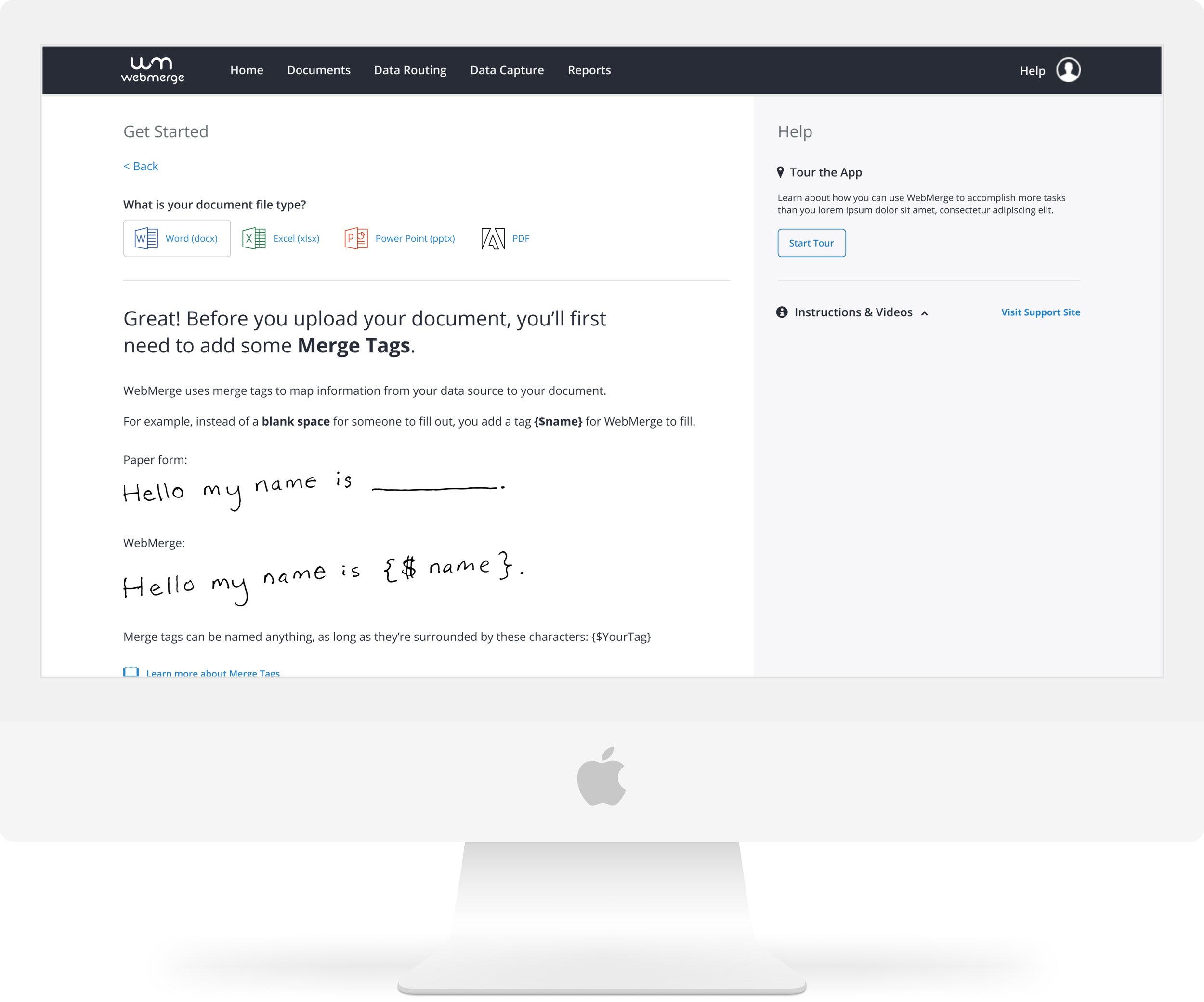
Onboarding Designs
Using the insights gathered from the entire research process, I kicked off a project attempting to improve the onboarding experience for new Webmerge customers.

Process
Outline the known problems:
The current Dashboard doesn’t offer enough help/support for new users.
Video length is too daunting.
Tab/Steps UI is confusing - looks like a wizard, but is informational.
Document types look like you’re supposed to choose which action you want to take, but it opens help documentation
Sidebar blog articles aren’t relevant to user at this time
Copy is long
Information is hidden behind tabs
Create user stories based on the problems. Lead a project kickoff, discuss goals and technical limitations and sketch with the team. Identify go-to-market considerations and success metrics.
Results
I designed a wizard style flow for new customers to create their first document merge. Each step of the process was designed with easy-to-understand language and simple clear options and path forward. A guided tour of the app as well as videos and support documentation is easily accessible in the sidebar at all times.
The Hand Off
Unfortunately I wasn’t able to follow the development of these designs after the team hand off as my primary team required my full focus. Webmerge, now Formstack Documents, now has a fully fleshed out cross-functional team and has made leaps and bounds with their user experience since I completed this project in late 2019.
Explore Other Projects
-
Phoenix Design System

-
Formstack Administration
